Migrating a Tableau Dashboard to Omni with Claude Code
This blog post was written with the assistance of Claude Code. Fitting, given the whole point: AI tooling turns tasks that used to be incredibly tedious into something you can ship in a fraction of the time.
Dashboard migrations are the worst kind of busy work. You know the drill: open the old tool, screenshot each chart, squint at calculated fields, then manually rebuild everything in the new platform. It's tedious, error-prone, and nobody's idea of a good time.
But here's the thing. A Tableau .twbx file is just a zip archive containing XML. And XML is text. And text is exactly what an AI agent can parse, analyze, and act on.
So I pointed Claude Code at a Tableau workbook (3,355 lines of XML, 3 worksheets, 27 columns) and asked it to migrate the dashboard to Omni. The result: a live, queryable dashboard deployed via API, with about 80% of the migration handled automatically.
Here's how it worked, what translated cleanly, and what still needs a human touch.
The Problem: Tableau Workbooks Are XML Black Boxes
Tableau packs a lot into its .twbx format. Connections, column metadata, calculated fields, table calculations, mark encodings, axis formatting, custom sorts, dashboard layout zones. All serialized as deeply nested XML that was never meant for human consumption.
The challenge isn't just reading the XML. It's translating Tableau's concepts into a completely different BI platform's mental model.
| Tableau Concept | Omni Equivalent | Translation Complexity |
|---|---|---|
| Data Source (Snowflake connection) | Connection + Shared Model | Low (already configured) |
| Columns / Fields | View dimensions & measures | Low (semantic layer maps 1:1) |
| Calculated Fields | SQL-based measures or dimensions | Medium (syntax translation) |
| Table Calculations (WINDOW_AVG) | No direct equivalent | High (needs custom SQL or manual) |
| Worksheets | Dashboard tiles with queryJson | Medium (query structure differs) |
| Mark Types (bar, line, dual-axis) | visConfig spec (line, bar, spreadsheet) | Medium (API constraints) |
| Dashboard Layout (pixel zones) | 12-column grid system | Low (proportional mapping) |
| Custom Sorts | Manual UI configuration | Not automatable via API |
| Number Formatting ($#,##0,,M) | Format strings (USDCURRENCY) | Partial (no compact millions) |
The Approach: Let Claude Code Read the Workbook
Claude Code can do something a human would dread: read thousands of lines of XML and extract structured meaning from it. The migration follows five steps:
- Unpack the
.twbx(it's a zip file) and locate the.twbXML inside - Parse the XML to extract data sources, columns, calculated fields, worksheets, filters, and layout
- Map Tableau fields to Omni's semantic layer (dimensions, measures, views)
- Build the Omni dashboard import payload with tiles, queries, and filters
- Deploy via the Omni document import API
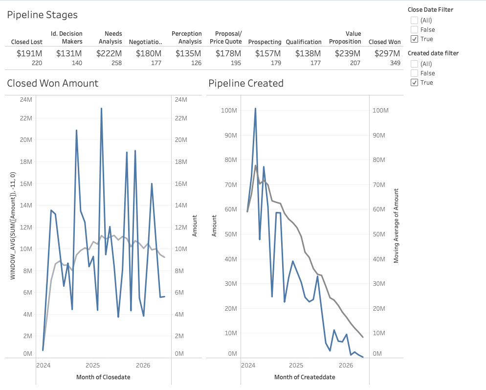
The Source Dashboard
The Tableau workbook is a Salesforce pipeline dashboard with three components:
| Worksheet | Chart Type | Key Logic |
|---|---|---|
| Pipeline Stages | KPI text strip (full width, top) | Stages as columns, $XM amount + opp count |
| Closed Won Amount | Dual-axis: bars + 12-month trailing avg line | Monthly SUM(Amount), Closed Won only |
| Pipeline Created | Dual-axis: bars + trailing avg line (gray) | Monthly pipeline by created date |
Layout: fixed 1000x800, KPI strip full width on top, two charts side-by-side below. Data source: Snowflake DEMO_DB.PUBLIC.SF_OPPORTUNITIES (27 columns, 2,500 rows).
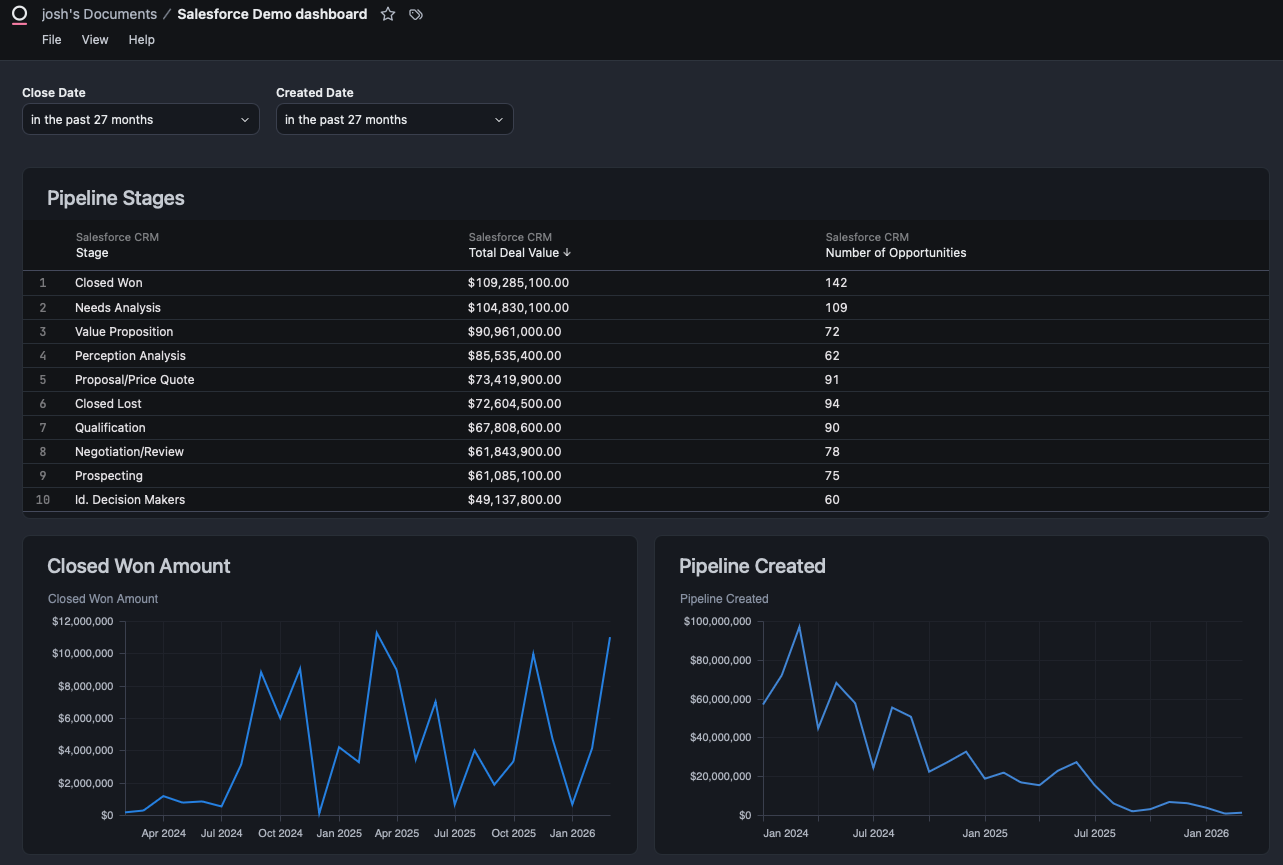
Before and After
Here's the Tableau dashboard (before) and the Omni version (after), deployed entirely via API from the parsed workbook XML.
Tableau (Before)
Omni (After)
Step 1: Parse the Tableau Workbook
The .twbx is a zip archive. Inside, the .twb file contains all the workbook logic as XML.
import zipfile
import xml.etree.ElementTree as ET

# Unpack the .twbx
with zipfile.ZipFile("dashboard.twbx", "r") as z:
    twb_files = [f for f in z.namelist() if f.endswith(".twb")]
    with z.open(twb_files[0]) as twb:
        tree = ET.parse(twb)
        root = tree.getroot()
Claude Code parsed the XML and produced a structured analysis covering:
- Connection details: Snowflake server, database, schema, table, authentication method
- 27 physical columns with data types, Tableau roles, and default aggregations
- 3 calculated fields: two date filters (
CLOSEDATE > date('2024-01-01')) and a 12-month trailing average (WINDOW_AVG(SUM([AMOUNT]), -11, 0)) - 3 worksheets with their fields, filters, mark types, and axis configurations
- Dashboard layout with pixel-level zone positioning
Here's what the calculated field extraction looks like:
| Field | Formula | Purpose |
|---|---|---|
| Close Date Filter | [CLOSEDATE] > date('2024-01-01') | Boolean filter on close date |
| Created Date Filter | [CREATEDDATE] > date('2024-01-01') | Boolean filter on created date |
| 12-Month Trailing Avg | WINDOW_AVG(SUM([AMOUNT]), -11, 0) | Rolling average over 12 periods |
The full analysis ran to 300 lines of structured markdown, covering every column, every filter, every mark encoding, and the complete dashboard layout with pixel coordinates.
Step 2: Map to Omni's Semantic Layer
This is where a previous project paid dividends. In a prior blog post, I used Claude Code to build a full semantic layer on the same Snowflake data source in Omni. The sf_opportunities view already had all the fields I needed:
stagename,amount,closedate,createddateas dimensionstotal_amount,total_won_amount,countas pre-defined measures- A
salesforce_crmtopic with AI context and sample queries
The semantic layer is the bridge between Tableau and Omni. Tableau's columns map directly to Omni view fields. The only gaps were Tableau's table calculations (like WINDOW_AVG), which have no direct Omni equivalent and need custom SQL or manual configuration.
Step 3: Create an Omni Branch
Every Omni migration should start on a branch, not the shared model. Claude Code created one using the Omni Python SDK:
from omni_python_sdk import OmniAPI
from datetime import date

api = OmniAPI(api_key=API_KEY, base_url=BASE_URL)

# Get the shared model to find its connection ID
models = api.list_models()
target = next(m for m in models["records"] if m["id"] == SHARED_MODEL_ID)

# Create a migration branch
branch_name = f"tableau-to-omni-migration-{date.today().isoformat()}"
result = api.create_model(
    connection_id=target["connectionId"],
    modelName=branch_name,
    modelKind="BRANCH",
    baseModelId=SHARED_MODEL_ID,
)
print(f"Branch: {result['model']['name']}")
Branch created: tableau-to-omni-migration-2026-03-25.
Step 4: Build the Dashboard via API
This is the core of the migration. Omni's document import API accepts a JSON payload that defines the entire dashboard: tiles, queries, visualizations, filters, and layout.
The Payload Structure
The dashboard name comes directly from the Tableau workbook. The <dashboard name="..."> attribute in the XML becomes the name field in both the dashboard and document sections of the import payload. This keeps the migrated dashboard identifiable.
The import payload has five top-level sections:
{
  "baseModelId": "...",
  "exportVersion": "0.1",
  "fileUploads": {},
  "dashboard": {
    "name": "Salesforce Demo dashboard",
    "metadata": { "layouts": { "lg": [...] } },
    "metadataVersion": 2,
    "queryPresentationCollection": {
      "filterConfig": { ... },
      "queryPresentationCollectionMemberships": [ ... ]
    }
  },
  "document": { ... },
  "workbookModel": { ... }
}
Tile Definitions
Each tile maps to a Tableau worksheet. Here's how the Pipeline Stages table tile is defined:
tile1 = {
    "queryPresentation": {
        "type": "query",
        "name": "Pipeline Stages",
        "prefersChart": False,        # Render as table, not chart
        "automaticVis": True,         # Required for any rendering
        "topicName": "salesforce_crm",
        "query": {
            "queryJson": {
                "table": "sf_opportunities",
                "fields": [
                    "sf_opportunities.stagename",
                    "sf_opportunities.total_amount",
                    "sf_opportunities.count"
                ],
                "filters": {
                    "sf_opportunities.closedate": {
                        "kind": "TIME_FOR_INTERVAL_DURATION",
                        "type": "date",
                        "left_side": "27 months ago",
                        "right_side": "27 months"
                    }
                },
                "version": 8,
                "dbtMode": False,
                "metadata": {},
                "userEditedSQL": ""
            }
        },
        "visConfig": {
            "visType": "omni-spreadsheet",
            "spec": {}
        }
    }
}
For the line charts (Closed Won Amount, Pipeline Created), the visConfig uses a cartesian spec with mark type, axis mappings, and series definitions. The key: date dimensions go on x, measures go on y, and _dependentAxis must be "y". Getting this wrong (date on y, measure on x) flips the chart horizontally.
"visConfig": {
    "visType": "basic",
    "spec": {
        "configType": "cartesian",
        "mark": {"type": "line"},
        "x": {
            "field": {"name": "sf_opportunities.closedate[month]"},
            "axis": {
                "sort": {
                    "field": "sf_opportunities.closedate[month]",
                    "order": "ascending"
                }
            }
        },
        "y": {
            "field": {"name": "sf_opportunities.total_won_amount"},
            "axis": {"title": {"value": "Closed Won Amount"}}
        },
        "series": [{
            "mark": {"type": "line", "_mark_color": "#298BE5"},
            "field": {"name": "sf_opportunities.total_won_amount"},
            "title": {"value": "Closed Won Amount", "format": "USDCURRENCY"},
            "yAxis": "y"
        }],
        "_dependentAxis": "y"
    }
}
Dashboard Layout
Omni uses a 12-column grid system. Tableau's pixel-based layout maps to grid coordinates:
{
  "layouts": {
    "lg": [
      {"i": "1", "x": 0, "y": 0, "w": 12, "h": 15},
      {"i": "2", "x": 0, "y": 15, "w": 6, "h": 42},
      {"i": "3", "x": 6, "y": 15, "w": 6, "h": 42}
    ]
  }
}
Tile 1 spans the full width (w=12) at the top. Tiles 2 and 3 sit side-by-side below (w=6 each). This maps directly to Tableau's layout: KPI strip full width on top, two charts 50/50 below.
Dashboard Filters
Omni supports dashboard-level filters that apply across tiles. The Tableau workbook used hardcoded calculated field filters (CLOSEDATE > date('2024-01-01')), which I translated to Omni's relative date filter format:
{
  "filterConfig": {
    "sf_opportunities.closedate": {
      "type": "date",
      "label": "Close Date",
      "kind": "TIME_FOR_INTERVAL_DURATION",
      "left_side": "27 months ago",
      "right_side": "27 months"
    }
  }
}
The upgrade: Omni's filters are interactive. Users can change the date range without editing a calculated field.
Deploy
One API call creates the entire dashboard:
response = requests.post(
    f"{BASE_URL}/api/unstable/documents/import",
    headers={"Authorization": f"Bearer {API_KEY}"},
    json=payload,
)
Result: live dashboard with three tiles, two date filters, and a 12-column grid layout.
Step 5: API Limitations and Manual Refinement
Let's be honest about what the API can and can't do. Omni's document import API is powerful, but it has constraints that make "100% automated migration" aspirational rather than actual.
What the API handles well
- Creating tiles with queries, filters, and field selections
- Setting up dashboard-level filters with relative date ranges
- Defining layout grids with precise positioning
- Configuring table/spreadsheet views with column formatting
What requires manual UI work
KPI cards. Tableau's KPI strip used mark labels with custom formatting ($12M, 45 Opportunities). The API renders this as a data table (omni-spreadsheet), which is functional but not as visually compact. Converting to Omni's KPI card format is a UI operation.
Table calculations. Tableau's WINDOW_AVG(SUM([AMOUNT]), -11, 0) (12-month trailing average) has no direct API equivalent in Omni. This needs to be built as a custom measure or SQL expression in the Omni model.
Custom sorts. Tableau's manual sort order for pipeline stages can't be set via the import API. It defaults to alphabetical or by value.
What Translated Automatically vs. What Didn't
| Tableau Feature | Auto-Migrated? | Notes |
|---|---|---|
| Data source connection | Yes | Snowflake connection already in Omni |
| Column definitions | Yes | Semantic layer view YAML |
| Worksheet queries (fields, filters) | Yes | queryJson in import payload |
| Chart types | Yes | Line/bar render vertically using bottom axis for dates |
| KPI strip | Partial | Renders as table, not KPI cards |
| WINDOW_AVG table calc | No | Needs manual Omni calculation or SQL |
| Custom sorts | No | Manual UI configuration |
| Dashboard layout | Yes | 12-column grid maps well |
| Date filters | Yes | filterConfig with TIME_FOR_INTERVAL_DURATION |
| Number formatting ($XM) | Partial | USDCURRENCY format, but not compact millions |
The honest tally: about 70% fully automated, 15% partially automated (functional but needs polish), and 15% manual. That 70% is the tedious, error-prone part that nobody wants to do by hand.
Key Takeaways
- AI can handle 80% of the migration. Parsing XML, mapping fields, translating queries, building payloads, deploying via API. The repetitive, error-prone work is exactly what Claude Code excels at.
- The semantic layer is the bridge. If your source and target tools share the same underlying data, the semantic layer (dimensions, measures, relationships) translates cleanly. Building it once pays dividends across migrations.
- Omni's visConfig compiles to Vega-Lite. Date dimensions go on
x, measures ony,_dependentAxismust be"y". Swapping them flips the chart horizontally.automaticVismust betrue.exportVersionmust be the string"0.1". These aren't documented, and discovering them takes iteration. - The "last mile" of visual polish still needs a human. KPI formatting, trailing averages, custom sorts. These are the details that make a dashboard feel finished, and they still require manual UI work.
- Documenting API quirks saves hours for the next migration. Every undocumented constraint I found (string filters need a
kindproperty,fileUploadsmust be{}not[]) is now captured in a reusable skill. - A reusable skill makes the second migration 10x faster. The first migration took iteration. The second one runs
/tableau-to-omni path/to/dashboard.twbxand gets a deployed dashboard with a list of manual adjustments needed.
The Skill
Everything learned in this migration is packaged as a reusable Claude Code skill: tableau-to-omni. It handles the full workflow: unpack the .twbx, parse the XML, map fields to the semantic layer, build the import payload, deploy via API, and report what needs manual adjustment.
Usage:
/tableau-to-omni path/to/dashboard.twbxThe skill is open source in the claude-omni-skills repo alongside the semantic layer setup and branch creator skills.
Thanks for reading. If you're planning a Tableau-to-Omni migration (or any BI tool migration), the combination of Claude Code and a well-built semantic layer gets you most of the way there. The last 20% is where your design judgment matters most.
- Josh