When Executives Want Excel and AI, and Your Data Team Wants Fewer Fire Drills
Disclaimer: The workflow, problem framing, and solution design behind this post are mine. I leveraged Claude Code to help enable me to share more content like this.
Every data team knows this tension. The CFO wants a monthly report in their inbox, formatted like the spreadsheet they've been reading for ten years. The VP of Operations wants to drill into regional trends on the fly. The analyst building both of those things wants to stop fielding messages that start with "Hey, quick question..." or "I have this simple task," because they know it's likely neither going to be simple nor quick.
These aren't competing requirements. They're the same requirement viewed from three different seats. The executive needs familiar, reliable delivery. The operator needs fast, self-service exploration. The data team needs fewer interruptions and full auditability when questions come up about the numbers.
The problem is that most organizations solve each of these with a different tool. Excel for the report. A dashboard for exploration. A ticketing system for the ad hoc queue. And the data team ends up maintaining all three, translating between them, and hoping the numbers match.
Omni solves this by collapsing all three into a single platform built on one semantic layer. To demonstrate how, I built a monthly report using commercial real estate leasing data that serves every persona: spreadsheet-style metrics delivered on a schedule, an AI assistant that answers follow-up questions in natural language, and a workbook environment where every AI-generated insight traces back to auditable SQL. The domain is leasing, but the pattern applies to any organization with recurring reports and a backlog of ad hoc questions.
Here's how it works, and how I built it.
The Real Cost of Ad Hoc Requests
Before diving into the solution, it's worth naming the problem clearly. In most organizations, the reporting workflow looks something like this:
- An analyst pulls data from the source system into Excel.
- They build a spreadsheet with period-over-period comparisons, conditional formatting, and summary rows.
- They email it to the leadership team on a monthly cadence.
- An executive reads the report, spots something interesting, and sends a follow-up question.
- The analyst drops what they're doing, writes a new query, formats the answer, and sends it back.
- Repeat steps 4 and 5 until the next monthly report is due.
Steps 4 through 6 are the problem. Each follow-up question is reasonable on its own. But in aggregate, they consume a huge portion of the data team's time. And the executive waits hours or days for answers they could have gotten in seconds if they had the right tool.
The goal of this blog is to highlight that with modern tooling and a properly maintained, well-built semantic layer, you can handle the entire lifecycle in one place: the familiar report, the automated delivery, the ad hoc exploration, and the data lineage.
Building the Foundation: Star Schema in Snowflake
Every good BI implementation starts with the data model. For this demo, I built a star schema in Snowflake using GSA (General Services Administration) leasing data, a publicly available dataset that mirrors the complexity of a real-world operational portfolio. The specific domain doesn't matter. What matters is the pattern: a clean data model that gives the semantic layer predictable structure to work with.
The schema includes:
- Fact table: Leases containing lease-level records with rent amounts, square footage, lease dates, renewal information, and status flags.
- Dimension: Markets/Regions providing geographic hierarchy from individual properties up to national regions.
- Dimension: Tenants with organizational details and business unit classifications.
- Dimension: Properties including building details, parking, and site characteristics.
- Dimension: Dates enabling flexible time-period analysis with fiscal year, quarter, and month breakdowns.
The star schema matters because it gives the semantic layer clean, predictable join paths. When Omni's AI assistant builds a query to compare metrics by region, it doesn't have to guess how to join tables. The relationships are defined once in the model and reused everywhere.
The Semantic Layer: Teaching the AI What the Data Means
A star schema gets you clean data. A semantic layer gets you contextualized data. This is the piece that makes everything else work.
In Omni, the semantic layer is defined as a topic, a curated collection of dimensions, measures, and relationships that maps business language to SQL. For this demo, I built a Leasing Analytics topic that includes:
| Layer | What It Contains | Why It Matters |
|---|---|---|
| Dimensions | Region, State, Market, Property, Tenant, Date fields | Enables drill-down from national to property level |
| Measures | Lease Count, Total Rent, Avg Rent/SF, Rentable SF, Renewal Months Left | Pre-defined aggregations the AI can reference by name |
| Calculated Fields | Period-over-period % change, Average Annual Rent, Rent per SF | Business logic defined once, reused across every query |
| Relationships | Lease to Market, Lease to Tenant, Lease to Property joins | The AI never has to guess how to join tables |
| Descriptions | Plain-language field descriptions and usage notes | Guides the AI toward correct field selection |
The semantic layer is the foundation for everything that follows. The dashboard queries it. The AI assistant queries it. The workbook queries it. One source of truth, three interfaces.
The Dashboard: Spreadsheet Familiarity, Live Data
The first thing an executive sees is the dashboard. In this demo it's a Monthly Leasing Report, but it could just as easily be a sales pipeline review, a financial summary, or an operational scorecard. The point is that it's designed to look exactly like the spreadsheet they're used to: rows of metrics, columns of time periods, color-coded percentage changes.
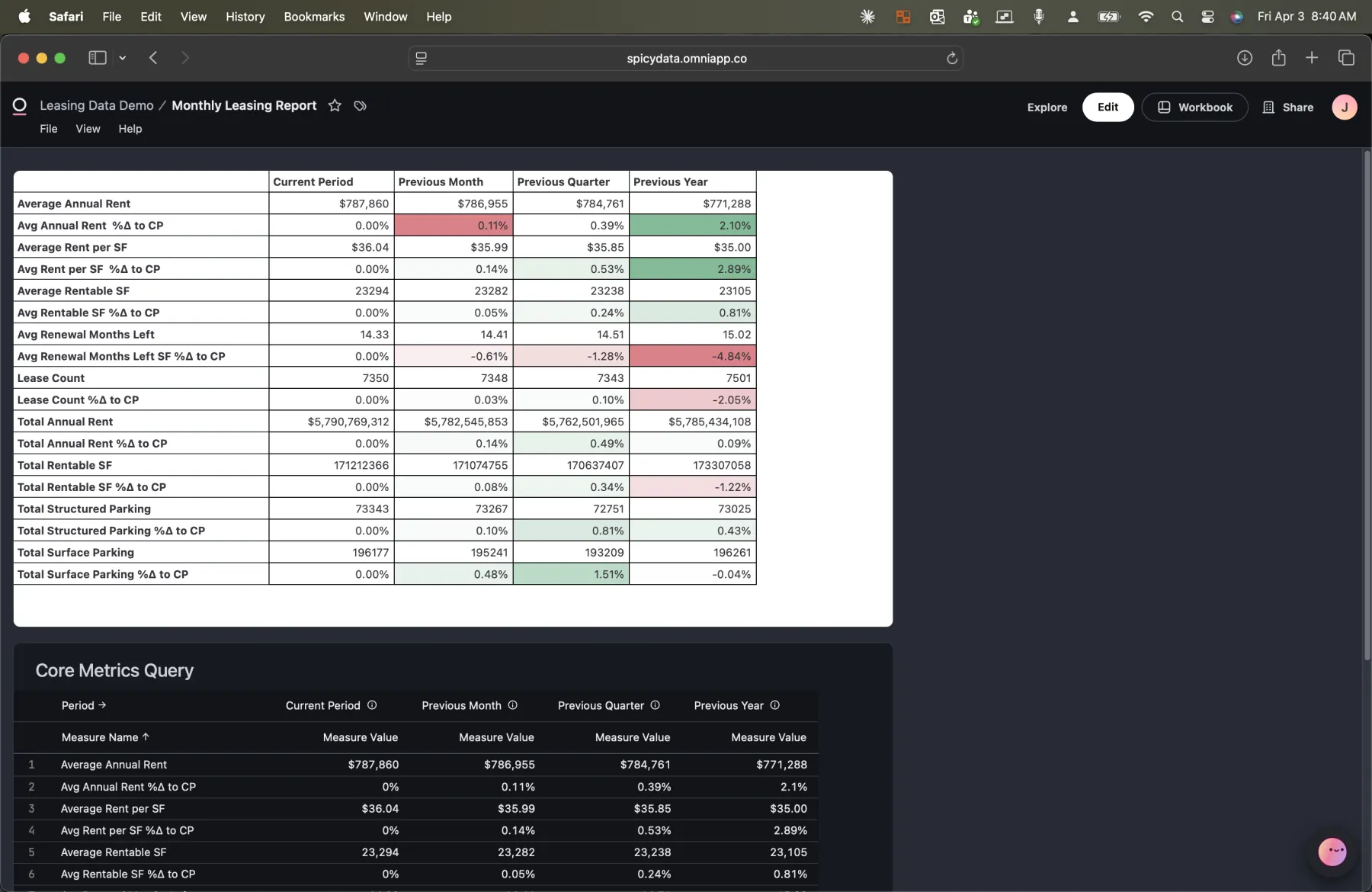
A note on the current state of things: the AI assistant can't yet ask questions directly against a spreadsheet cell. The underlying complexity of unpacking both the spreadsheet logic and the SQL logic makes this a non-trivial problem. That's why you'll notice a Core Metrics Query sitting beneath the formatted chart, a pure SQL query the AI can interact with. I've spoken with Omni's product team and this capability is on their roadmap. Given how quickly they ship, I wouldn't be surprised to see it land soon.
The key metrics include Average Annual Rent, Rent per SF, Average Rentable SF, Renewal Months Left, Lease Count, Total Annual Rent, Total Rentable SF, and parking metrics. Each one shows the current value alongside previous month, previous quarter, and previous year comparisons with conditional formatting (green for positive trends, red for negative).
This isn't a static screenshot. It's a live query against the semantic layer. When the underlying data changes, the report updates automatically. No analyst has to rebuild the spreadsheet.
Automated Delivery: The Report Comes to You
The executives who've been getting Excel reports via email for years don't need to change their workflow. Omni's scheduled delivery feature sends the report to their inbox on whatever cadence they need.
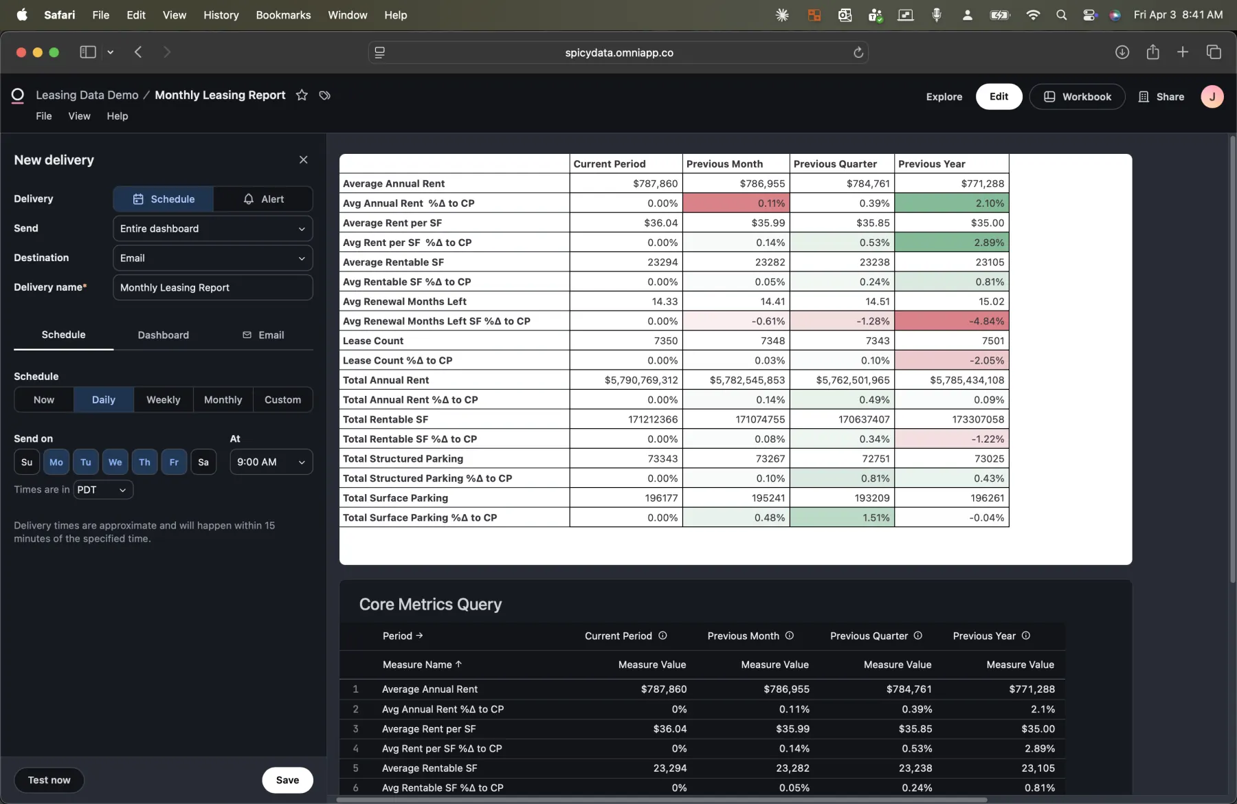
Setting up a delivery takes seconds. Choose the frequency (daily, weekly, monthly, or custom), pick the days, and set the send time. The report is generated fresh each time, pulling the latest data from the semantic layer.
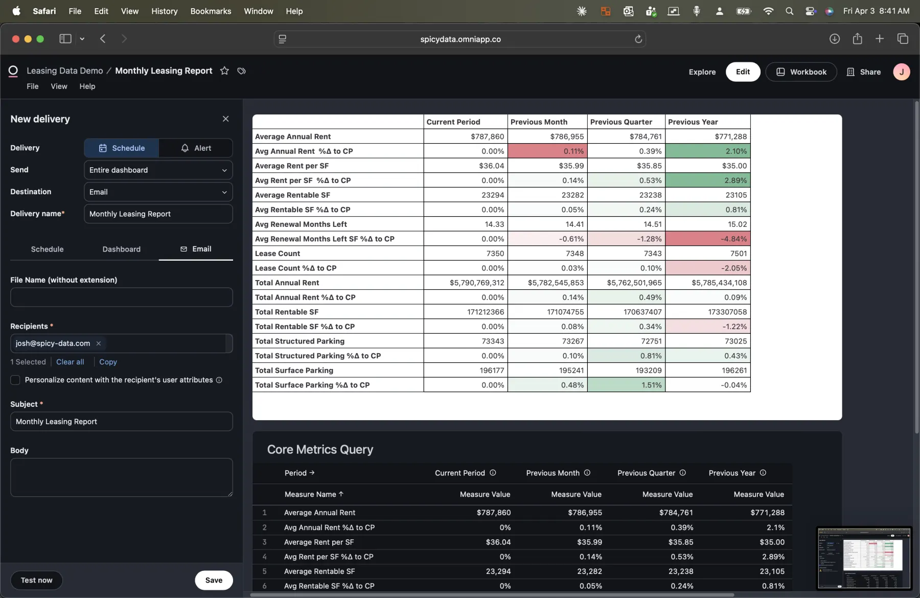
The email configuration supports multiple recipients, custom subject lines, and personalized content. You can attach the report as a PNG, PDF, or CSV, and include a link back to the live dashboard for anyone who wants to explore further.
This is the part that eliminates step 1 through 3 of the old workflow entirely. The analyst doesn't pull data into Excel, doesn't format the spreadsheet, doesn't send the email. It just happens.
Self-Service Exploration: Reducing the Ad Hoc Queue
Now for the part that eliminates steps 4 through 6. When an executive reads the report and has a follow-up question, they don't need to message the data team. They can right-click any tile on the dashboard and explore the data themselves, or ask the AI assistant.
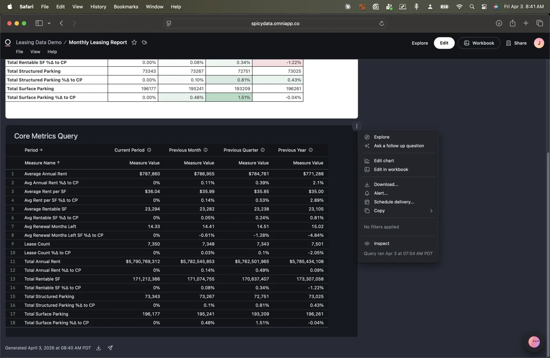
Every tile on the dashboard has a context menu with options to explore the underlying data, ask a follow-up question powered by AI, download the data, or inspect the query. This is the bridge between "I see the number" and "I understand the number."
The AI Assistant: Natural Language, Semantic Precision
The AI assistant is where Omni's semantic layer really pays off. Click into the assistant, and it surfaces the data from whatever tile or query you're looking at. Then you can ask questions in plain English.
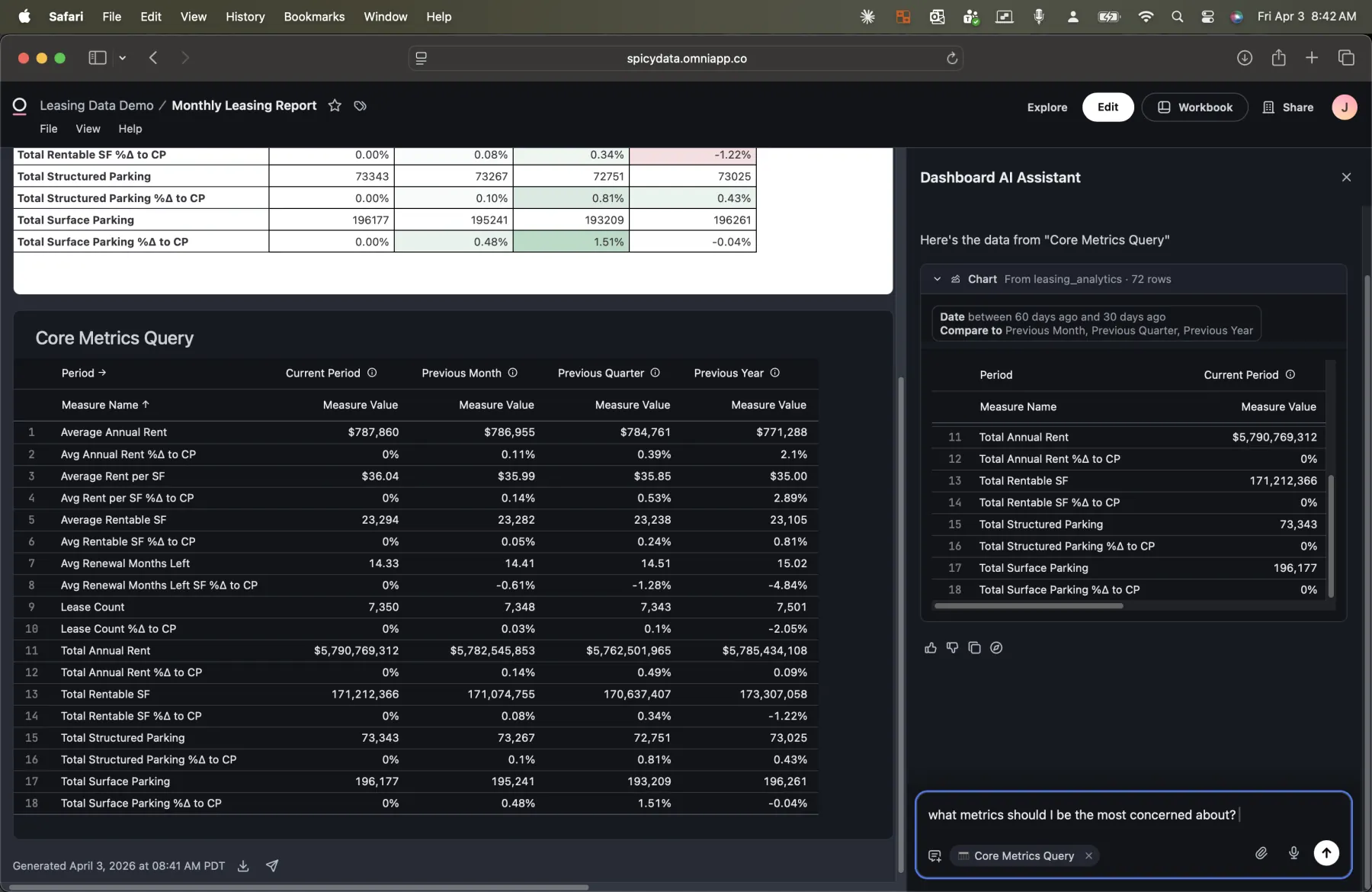
In this example, I asked "What metrics should I be most concerned about?" The AI analyzed the period-over-period data and surfaced three key concerns:
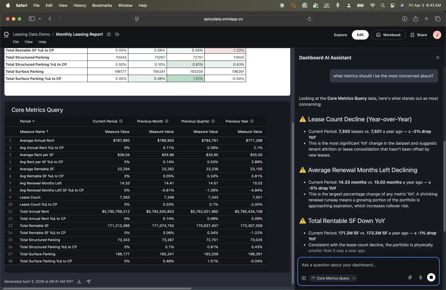
- Lease Count Decline (Year-over-Year): Current period shows 7,350 leases vs. 7,501 a year ago, a 2% drop. The AI notes this suggests tenant attrition or lease consolidation that hasn't been offset by new leases.
- Average Renewal Months Left Declining: Down from 15.02 months to 14.33 months year-over-year, a 5% drop. The AI flags that shrinking renewal runway means a growing portion of the portfolio is approaching expiration.
- Total Rentable SF Down YoY: 171.2M SF vs. 173.3M SF a year ago, a 1% decline. Consistent with the lease count decline.
But the AI doesn't just flag problems. It also identifies what's holding steady:
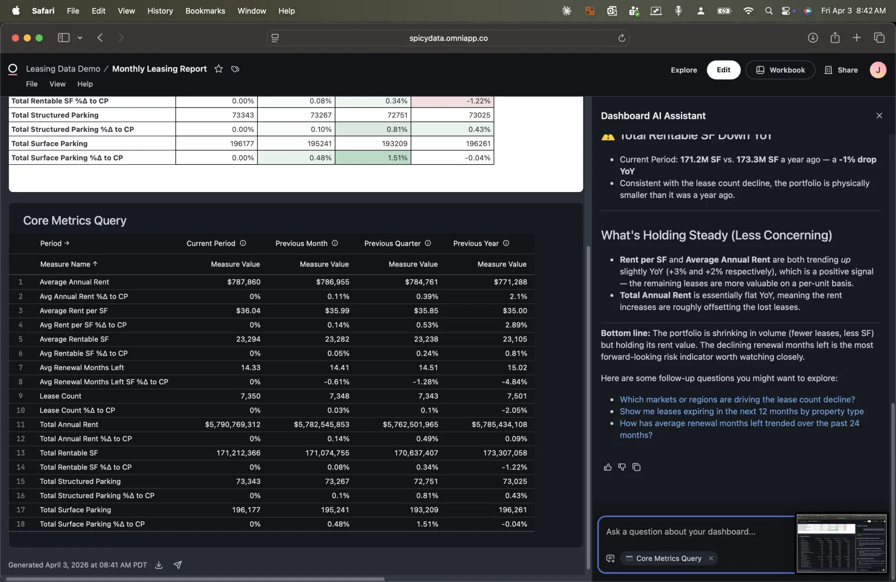
Rent per SF and Average Annual Rent are both trending up, which is a positive signal: the remaining leases are more valuable on a per-unit basis. The AI provides a bottom-line summary and suggests follow-up questions the executive might want to ask next.
This is the interaction that used to be a Slack message to the data team. Instead, the executive gets an answer in seconds, grounded in the same semantic layer that powers the monthly report.
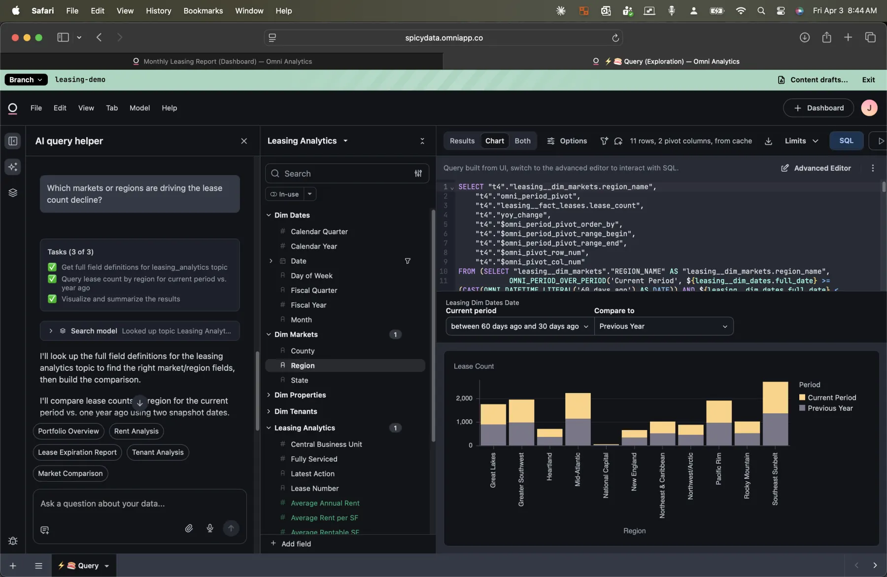
Going Deeper: AI-Driven Regional Analysis
The real power shows up when you ask a follow-up question that requires a new query. I asked: "Which markets or regions are driving the lease count decline?"
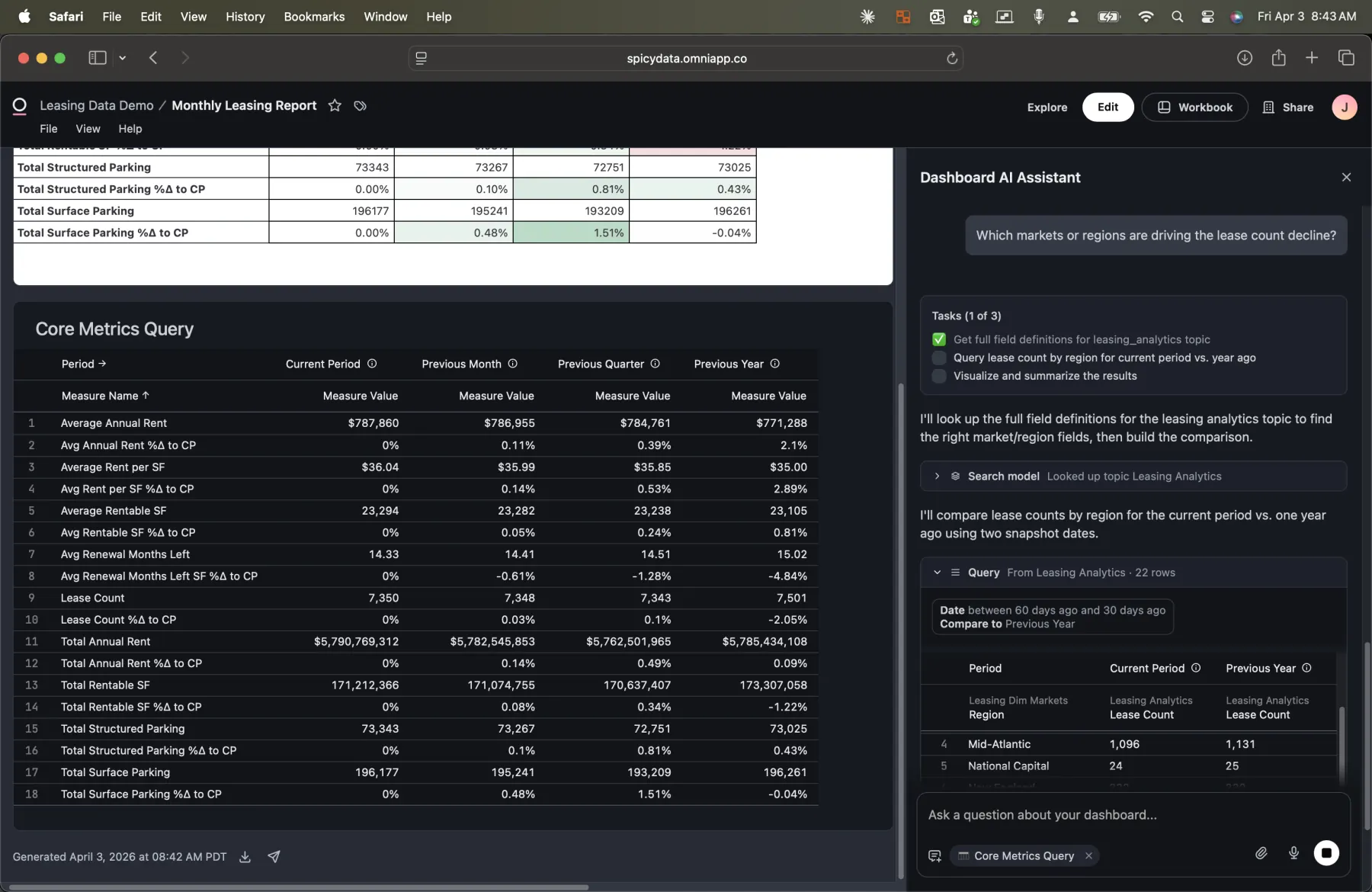
Watch what happens. The AI doesn't just answer from the data it already has. It:
- Looks up the field definitions in the Leasing Analytics topic to find the right market/region fields.
- Builds a new query comparing lease count by region for the current period vs. one year ago.
- Executes the query and visualizes the results.
- Summarizes the findings with key takeaways.
Because the query is built against the semantic layer, the AI selects the correct fields, applies the correct joins, and uses the correct aggregation logic. It's not guessing at SQL. It's using the same curated model that powers the dashboard.
Full SQL Lineage: Trust, But Verify
Here's the part the data team cares about most. Every query the AI builds opens in Omni's Workbook, a full exploration environment with a field picker, SQL editor, and interactive chart.
This is the complete audit trail. The data team can see:
- The exact SQL the AI generated, including the SELECT fields, joins, filters, and GROUP BY clauses.
- Which semantic layer fields were selected from the topic (visible in the field picker on the left).
- The visualization the AI created, a bar chart comparing lease counts by region across the current period and previous year.
- The raw results in tabular form, available by switching from Chart to Results view.
When a question comes up about an AI-generated insight ("Where did the AI get this number?"), the data team doesn't have to reverse-engineer anything. They open the workbook, read the SQL, and verify the logic. Full transparency.
AI-Generated Insights with Context
The AI doesn't just return raw data. It synthesizes findings into actionable takeaways.
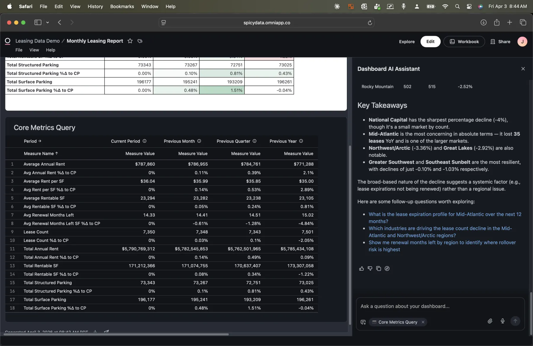
For the regional lease count analysis, the AI identified that:
- National Capital has the sharpest percentage decline at roughly 4%, though it's a small market by count.
- Mid-Atlantic is the most concerning in absolute terms, losing 30 leases and being one of the larger markets.
- Greater Southwest and Southeast Sunbelt are the most resilient, with declines of just 0.10% and 1.03% respectively.
- The broad-based nature of the decline suggests a systemic factor (e.g., lease expirations not being renewed) rather than a regional issue.
It then suggests follow-up questions: What is the lease expiration profile for Mid-Atlantic? Which industries are driving the decline? What do renewal months left look like by region? Each of these would have been a separate ad hoc request in the old workflow. Here, the executive can ask them one after another, in real time.
Three Problems, One Platform
This blog isn't about any single feature. It's about how the way that organizations can consume and interact with data has fundamentally changed.
| Persona | What They Need | How Omni Delivers It |
|---|---|---|
| Executive | Familiar spreadsheet report, delivered on schedule | Dashboard with scheduled email delivery (PNG, PDF, or CSV) |
| Operator / VP | Fast answers to follow-up questions without waiting | AI assistant that builds queries from the semantic layer in seconds |
| Data Team | Fewer ad hoc requests, full auditability | Workbook with complete SQL lineage for every AI-generated query |
The semantic layer is the thread that connects all three. The executive's report, the AI's analysis, and the data team's audit trail all query the same model. There's no translation layer between tools, no reconciliation, no "the numbers don't match" conversations.
What It Takes to Build This
If you're considering this approach for your organization, here's what's involved:
- Clean data model: A star schema (or well-structured tables) in your data warehouse. Omni connects to Snowflake, BigQuery, Redshift, Databricks, and others.
- Semantic layer in Omni: Define your topics with dimensions, measures, relationships, and descriptions. This is the investment that pays off across every feature.
- Dashboard design: Build one or more dashboards that serve your executive reporting needs. Omni's spreadsheet-style tiles make this straightforward.
- Delivery configuration: Set up scheduled deliveries for the stakeholders who want reports pushed to them.
- Enable AI: Once the semantic layer is in place, the AI assistant works out of the box. No additional configuration required.
The biggest investment is step 2: building a thoughtful semantic layer. But that's also the step that reduces your long-term maintenance burden. Every ad hoc question that the AI handles correctly is one less ticket in the data team's queue.
The Bottom Line
Organizations don't have a reporting problem or an exploration problem or an ad hoc problem. They have a "these are all the same problem solved with different tools" problem.
Omni's approach, one semantic layer powering dashboards, scheduled delivery, AI exploration, and full SQL lineage, means the executive gets their spreadsheet, the operator gets instant answers, and the data team gets their time back. All from the same source of truth.
I used leasing data for this demo, but the pattern applies to any domain where you have structured data, recurring reports, and a backlog of ad hoc questions: sales, finance, operations, HR. If that sounds like your organization, let's talk.
- Josh